
Messaging Automation Metrics: What to Track, and What Your Tool Can Actually Show You
Two of the messaging automation metrics on your dashboard get better when your business gets worse.
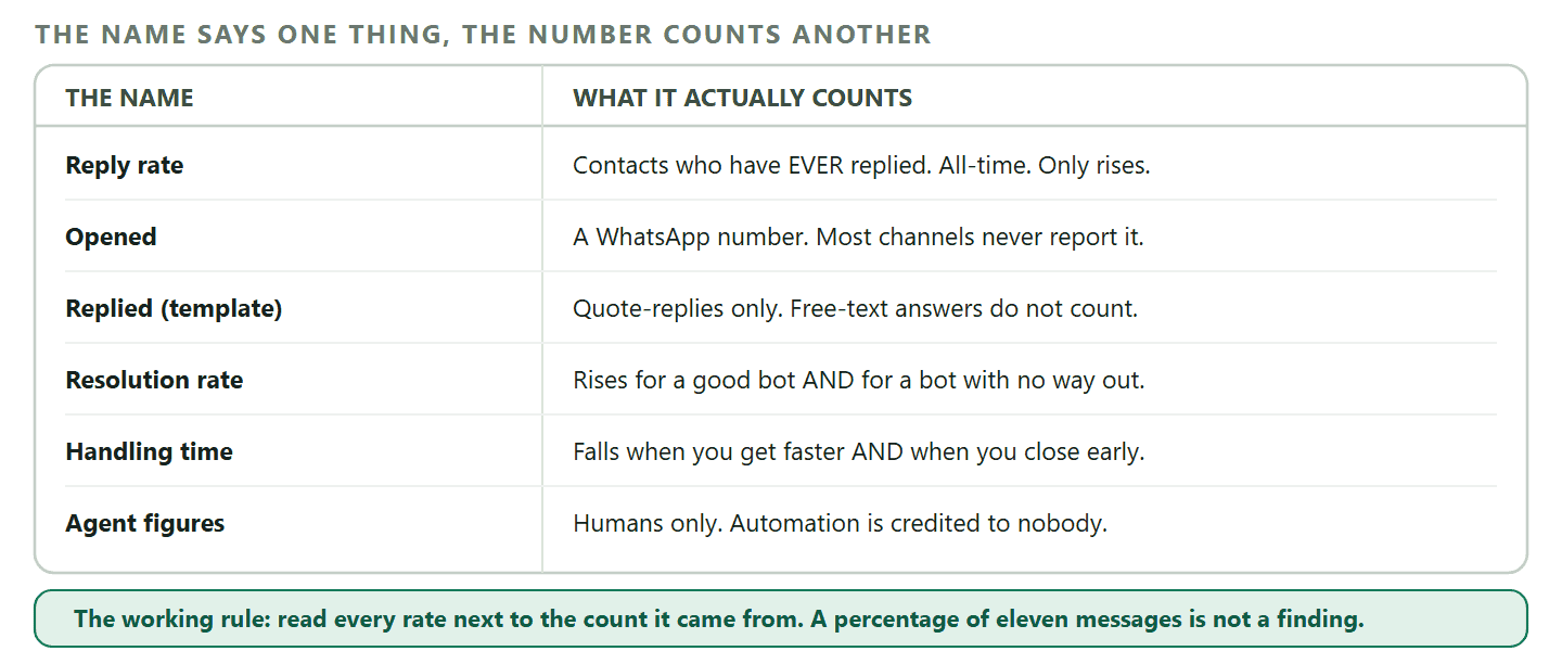
The first is the share of conversations your automation finishes without a human. It goes up when the bot is genuinely good. It also goes up when the bot has quietly stopped offering a way through to a person, and the customers who wanted one have given up and gone to whoever answers. Same number, opposite meanings, and nothing on the screen tells you which one you are looking at.
The second is average handling time. It falls when your team gets faster. It also falls when a busy team starts closing conversations that were not actually finished, which shows up six weeks later as the same customers asking the same question again.
Almost every list of metrics for messaging automation skips this, and the bigger problem is that most of those lists include numbers no tool in this category actually reports. You read the list, you go looking for “sentiment trend” or “cost per lead”, and there is nothing there.
So this guide does two things at once. It gives you the metrics worth tracking after you turn automation on, and for each one it tells you where the number comes from, what it actually counts, and which way it can lie. Where a metric does not exist anywhere, it says so, and says what to do instead.
Start with one outcome, not a dashboard
Pick the single number that would make you say the automation was worth paying for, write it down, and put a date on it. Everything else on this page is either evidence for that number or a distraction from it.
For most small businesses it is one of four:
- More booked appointments from the same amount of attention. A dental practice measures this in appointments per month, not in messages sent.
- Fewer hours spent answering the same question. A furniture shop with one person on the phone measures this in hours, and the honest version is “how many evenings did I get back”.
- Faster first reply, because in most local trades the business that answers first gets the job.
- More repeat purchases from people who already bought once.
Write the number you are at today next to it, even if the number is a guess. A guess you wrote down in September is worth far more in December than a precise figure you started collecting in November, because it gives you a before.
Then pick a second number that would tell you the first one is being bought at too high a price. Bookings up and opt-outs up is not a win, it is a loan. Response time down and satisfaction down means the team is typing faster and helping less. Two numbers, one you want to move and one you want to watch, will beat a dashboard of twenty every time.
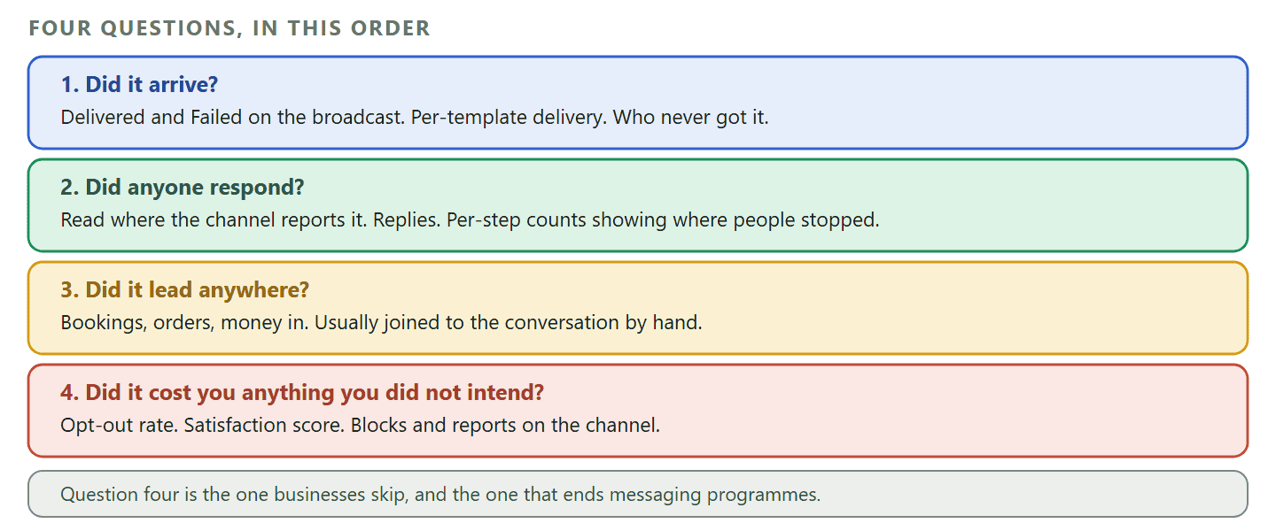
The four questions your messaging automation metrics have to answer
Every useful metric on this page is evidence for one of four questions. Grouping them this way is more useful than grouping them by channel, because it stops you comparing a WhatsApp number with an Instagram number that was collected differently.
- Did it arrive? Delivery, failures, and who never got it.
- Did anyone respond? Replies, taps, and conversations that actually started.
- Did it lead anywhere? Bookings, orders, and money.
- Did it cost you anything you did not intend? Opt-outs, complaints, and satisfaction.
The fourth is the one businesses skip, and it is the one that ends programmes. A campaign that produced eleven orders and forty opt-outs was not a good campaign, it was a good week followed by a smaller list.
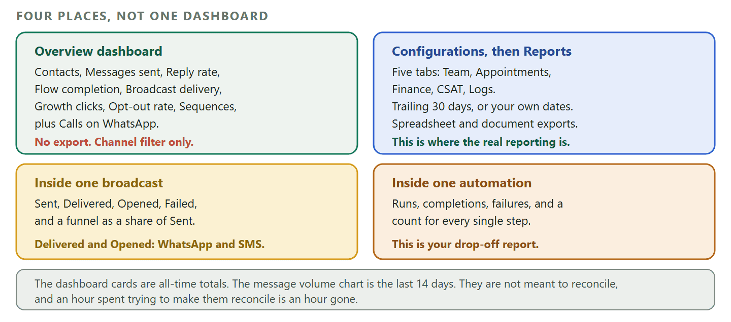
The messaging automation metrics your tool reports for you
These are the numbers you do not have to build. The labels below are DMly’s, verified against its documentation in September 2026, but the shape is the same across serious tools in this category, and knowing the shape tells you what to look for in whatever you use.
On a broadcast: Sent, Delivered, Opened, Failed
Every campaign you send gets its own funnel, expressed as percentages of Sent. Sent means the messages DMly successfully handed to the channel. Delivered means the channel confirmed the message reached the contact. Opened means the contact read it, counted once per contact. Failed covers recipients where it did not send or was later reported undeliverable.
The catch is which channels report which. Delivered and Opened only exist on WhatsApp and SMS, and SMS reports Delivered but not Opened. Facebook and Instagram report neither at the broadcast level, though the individual messages still show in the inbox, and Telegram sends no delivery confirmations at all. So a Facebook broadcast funnel with only the first bar filled in is not a bad campaign, it is a channel that does not tell you. Meta channels get a separate Messenger delivery panel instead, splitting the result by message type: sent inside the 24 hour window, sent as an opted-in notification, or skipped.
Per template: Sent, Delivered, Read, Replied, Failed
A WhatsApp template carries its own running totals across every place it is used, which is more useful than it sounds. The same booking confirmation might go out from a broadcast, a flow, a sequence and an automatic notification, and the template view is the only place you see all four added up.
Replied here is stricter than you would guess. It counts explicit replies that quote the template, not the free-text message a customer sends thirty seconds later. So a template whose Replied figure looks poor may be doing fine; you are seeing the quote-reply habit, not the conversation.
Inside an automation: runs, completions, failures and per-step counts
This is your drop-off report, and most people never open it. A flow records how many times it ran, how many runs completed, how many failed, and a count for each individual step. Two steps in a row with a gap between their counts is exactly where people are leaving, and it is usually a question that asked for something the customer did not have to hand.
A simpler quick automation only records how many times it ran, which is enough for a rule but not enough to debug a conversation. Per-automation figures live inside the automation itself, under Analytics, rather than on the main dashboard.
Per teammate: response and resolution times
The team report sits under Configurations, then Reports, then the Team tab, and it covers the trailing 30 days by default with From and To dates you can set. Per agent it gives Assigned, Closed, Replies, Contacts, Avg first response (how long until that agent’s first reply after the conversation was assigned to them) and Avg resolution (how long the conversation stayed open before that agent closed it).
Two rules decide whether these numbers mean anything in your workspace. Automation replies do not count towards an agent’s figures, and conversations closed by automation are not credited to anybody. So a heavily automated workspace will show a small team handling a small number of conversations very attentively, which is true, and says nothing about the volume the automation absorbed. Read the team report next to the flow numbers, never on its own. For what a genuine improvement in these figures looks like when it is worked through end to end, with the arithmetic shown, see our worked case study on cutting response time.
Satisfaction, if you ask for it
Satisfaction is the one experience metric that actually exists, and it exists only if you put a survey step in a flow. You choose a 3 point scale, delivered as tappable buttons, or a 5 point scale delivered as a list, with a default question of “How would you rate our support today?” that you can change. Each score has its own exit, so an unhappy answer can go straight to a person instead of into a report nobody reads.
The report gives you Response rate (answered divided by sent plus answered, with failed sends excluded), Average score across answered surveys only, Satisfaction as the share landing on the top two points of whichever scale you chose, plus Answered and Awaiting reply.
The timing trap: The timing trap WhatsApp only allows a free-form message within 24 hours of the customer’s last message. A 5 point survey outside that window falls back to an approved template, which Meta has to approve first, and a 3 point survey cannot be sent outside the window at all. So ask while the conversation is still warm. A survey sent the next morning is a survey that mostly does not send.
Bookings, attendance and what they were worth
If you sell time rather than stock, this is the report that answers question three, and it is the one most people never find because it does not live inside the appointments screen. It sits under Configurations, then Reports, then Appointments, and it opens on five figures: Total bookings, Completed, No-show rate, Revenue (paid) and Avg class fill.
Underneath are two tables that do the actual work, one breaking those figures down by service and one by staff, with From, To, staff, service and status filters that apply to everything on the page. A pilates studio comparing fill rates across its six weekly classes will learn more from that second table in five minutes than from a month of watching message counts. If you are still setting the bookings side up, our guide to taking appointments through WhatsApp covers the flow that feeds it.
Where people came from
Trackable links and QR codes count their own use: clicks on a link, scans on a code. That is the tap itself, so somebody who opens the link and never messages still counts, which makes the pair of numbers useful rather than the click alone. When a message does arrive from one of those tools, the tool’s name is stamped onto the contact as their source, and it only fills a source that was empty, so anything your team typed by hand survives.
One documented limit worth knowing before you print a poster: on WhatsApp the source stamp applies to brand new contacts only, so an existing customer who scans your code keeps whatever source they already had. Facebook, Instagram and Telegram attribute every arrival. If you want the full picture of what a tracked link can and cannot tell you, our guide to click-to-chat links and what they cannot measure goes through it properly.
What those numbers actually count
Half the value of any list of messaging automation metrics is stopping you reading a number as something it is not. These are the ones that catch people out.
Reply rate is not what you think, and it can only go up. On the overview dashboard, reply rate is the share of your contacts who have ever sent you an inbound message. It is an all-time figure. Somebody who replied once in 2024 counts exactly the same as somebody who replies every week, and the number only ever moves down if you add contacts who never reply. It is a decent measure of whether your list is made of real people, and it is useless as a measure of last month.
The dashboard mixes two time frames on purpose. The message volume chart is fixed at the last 14 days, the peak hours heatmap covers 28, and the cards around them are all-time totals since you opened the workspace. There is no date picker; the only filter is the channel selector. Once you know that, the dashboard is useful. Before you know that, it looks broken.
Opened is a WhatsApp number. If you run campaigns on several channels and compare their open rates, you are comparing WhatsApp against channels that do not report opens at all. This is the same trap as comparing a WhatsApp read against an email open, which our piece on what open rates do not tell you takes apart in detail.
Opt-out rate is a workspace figure, not a campaign figure. You can see that opt-outs went up. Attributing them to the campaign that caused them means noting the number before you send and again after, which takes ten seconds and is the single most useful habit on this page.
Money in, Billed and Outstanding answer three different questions. The finance report gives Money in (cash that arrived in the period, net of refunds and excluding tips), Billed (what you invoiced in the period, paid or not), Outstanding (what clients owe you right now, which ignores your date filter entirely), Spent and Net profit. The documentation says it plainly: do not add Money in, Billed and Outstanding together. They are a cash figure, an invoicing figure and a snapshot, and summing them produces a number that means nothing.
Two things on a broadcast that are not data, as of September 2026: Two things on a broadcast that are not data, as of September 2026 A broadcast’s Replies figure is documented as always reading zero, on every channel. And the Engagement over time chart on a broadcast is placeholder data with the same fixed shape for every broadcast, so it is not showing you your campaign. Neither is a reason to distrust the funnel, which is real, but do not take a decision from either. Both are the sort of thing that gets fixed, so check the docs before you rely on this paragraph.
The messaging automation metrics you derive with one division
These are not on any screen and you can have them in a minute a month. Each one is two numbers you already have, divided.
- Conversations per booking. Appointments in the period, from the appointments report, divided into conversations in the period. A driving school that needs nine conversations per booking in March and six in June has learned something real about its new flow.
- Revenue per conversation. Money in from the finance report, divided by conversations. Crude, and still the fastest sanity check on whether messaging is carrying its own weight.
- Cost per conversation. Your plan cost plus your channel message costs, divided by conversations. On WhatsApp the message cost is the part that moves, and it moves again from 1 October 2026, when service messages and utility templates sent inside an open window start being charged.
- Drop-off at a step. The count at one step in a flow divided by the count at the step before it. Anything under about half is a question worth rewriting.
- Handover rate. Conversations assigned to a person, from the team report, divided by flow runs. Rising handover is not automatically bad; it is bad only if the same subject keeps causing it.
The one that needs care is anything called return on investment. You can build it: money in, minus what the tool and the messages cost, over what the tool and the messages cost. It is honest only if messaging is genuinely the channel that produced the money, and for most businesses some of it would have arrived anyway. Publish the number with the assumption written next to it, or do not publish it. A ratio nobody can argue with is usually a ratio nobody checked.
The messaging automation metrics nobody reports, and what to do instead
These appear on every metrics listicle, including the previous version of this page, and no messaging tool in this category produces them. Knowing that saves you an evening of looking.
| The metric you were told to track | Why it is not there | What to do instead |
| Net Promoter Score | NPS is a survey methodology, not a messaging figure | Run the satisfaction survey you do have, and read the low scores rather than the average |
| Sentiment trend over time | Nothing scores the emotional tone of your threads | Read ten conversations a month yourself. It is slower and much better |
| Average handling time | Resolution time exists per agent; handling time does not | Use Avg resolution from the team report and remember what it excludes |
| Sales cycle length | Needs a first-touch and a closed-won date joined together | Use pipeline stage dates on the contact if you work them consistently |
| Cost per lead | Ad spend lives with the ad platform, not the inbox | Divide your own ad spend by contacts whose source is that campaign |
| Repeat contact rate | Nothing groups two conversations as the same issue | Tag the reason on close for one month, then count the tags |
| Opt-outs per campaign | Opt-out rate is a workspace figure | Note it before you send and again after |
There is a pattern in that right-hand column. The metrics a tool cannot give you are almost always recoverable by a small manual habit kept for a month, and the habit teaches you more than the number would have. Tagging the reason on close for four weeks tells a shop owner more about their business than a sentiment chart ever would.
Which messaging automation metrics matter in the first 30 days
In the first month the messaging automation metrics are not measuring performance, they are checking that the thing works. Five numbers, in this order, and nothing else.
- Failed sends. Anything above a trickle is a setup problem, not a marketing one. Fix it before you look at another number.
- Flow completion, and the step where it stops. The first version of any flow loses people at one specific step, and you will find it in ten minutes in the per-step counts.
- Opt-out rate, noted weekly. This is your early warning that the frequency is wrong, and it is much cheaper to catch in week two than in month four.
- Conversations that reached a person. If the answer is none, your automation is a wall, not a front desk. If the answer is nearly all of them, the automation is not doing anything yet.
- Your one outcome from the top of this page, compared with the guess you wrote down.
Everything else can wait until month two. A dashboard read daily in week one mostly produces anxiety, because the samples are too small for any rate to be stable. That is worth saying plainly: a rate calculated on fewer than about fifty events is a story, not a measurement.
If your automation is still being built rather than measured, the sequencing in our guide to WhatsApp business automation, from triggers through to templates covers what to turn on first, and the broadcast side of it sits in opt-in, templates and timing for broadcasts.
A monthly review that takes fifteen minutes
The reason most measurement programmes die is that they were designed for someone with an afternoon. This one fits between two appointments.
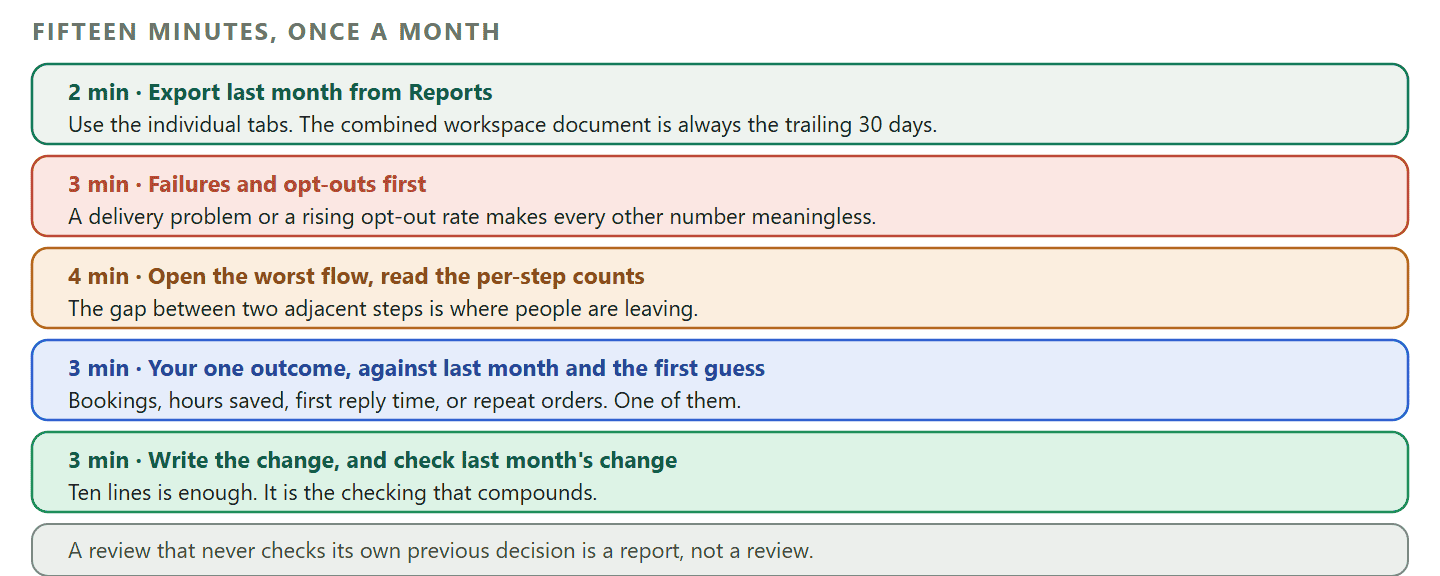
Open the reports section under Configurations, set the date range to last month, and export the ones you want. Five tabs export: team performance, appointments, finance, satisfaction and logs, each as a spreadsheet and as a formatted document. There is also a combined workspace document that covers several of them at once.
One thing to watch on the combined report: One thing to watch on the combined report The workspace document always covers the trailing 30 days, whatever date range you set on the tabs. If you are reviewing a specific campaign month, export the individual tabs rather than the combined one, or you will be reading the wrong period without noticing.
Three more practical limits, all documented. There is no scheduling and no emailing, so the review happens because you put it in your calendar rather than because a report arrived. Log exports are capped at the most recent 5,000 rows. And nothing on the overview dashboard exports at all, so if you want those headline numbers in a spreadsheet you either write them down or pull them through the API.
Then answer four questions in writing, in about ten lines:
- What is my one outcome now, against last month and against the starting guess?
- Which single step or message lost the most people, and what will I change about it?
- Did opt-outs move, and what did I send in the week they moved?
- What did I decide last month, and did it work?
That last one is the one that compounds. A review that never checks its own previous decision is a report, not a review.
Frequently asked questions
What are messaging automation metrics?
They are the numbers that tell you whether automated conversations are working: whether messages arrived, whether people responded, whether anything came of it, and what it cost you in goodwill. The useful ones are the ones your tool actually produces, which is a much shorter list than most articles suggest.
How many messaging automation metrics should I track?
One outcome and one counterweight to begin with, then about five once the automation is a few months old. A business tracking twenty metrics is usually a business that has not decided what it wants.
Which metrics matter most in the first 30 days?
Failed sends, flow completion and the step where people stop, opt-out rate, how many conversations reached a person, and your one chosen outcome against the guess you wrote down at the start. Nothing else, because the samples are too small to mean anything.
Does DMly show average response time?
Yes. The team performance report, under Configurations then Reports then the Team tab, shows Avg first response and Avg resolution both for the team and for each agent, over the trailing 30 days or a date range you set. Two things to remember when reading it: automation replies are not credited to an agent, and conversations closed by automation are not credited to anybody, so in a heavily automated workspace the report describes the human half of the work only.
How do I measure return on investment from messaging automation?
Take money in for the period from the finance report, subtract what the tool and the messages cost you, and divide by that same cost. Then write next to it the share of that revenue you honestly believe would have arrived anyway. The second half is what makes it a measurement instead of a slogan.
Why do the numbers on my dashboard not add up?
Because they are not measuring the same period. The message volume chart covers the last 14 days, the peak hours view covers 28, and the summary cards are all-time totals since the workspace was created. They are three different questions displayed on one screen, which is normal and worth knowing before you spend an hour reconciling them.
Can the wrong messaging automation metrics damage customer experience?
Yes, and it usually does it quietly. Reward a team on speed and conversations get closed rather than solved. Reward automation on resolution rate and the route to a human gets narrower every quarter. The protection is the counterweight metric: pair every efficiency number with a satisfaction or opt-out number and read them together.
How often should I review?
Monthly for the outcome, weekly for opt-outs and failures in the first couple of months, and immediately whenever you change a flow. Daily review of rates is not diligence, it is noise, because the daily samples are too small for the percentages to sit still.
If you are setting this up rather than reporting on it, the order that works is: get every channel into one inbox so the conversations are in a single place to count, put a satisfaction step at the end of the flows that matter, and write down your one outcome before you turn anything on. DMly reports the delivery, flow, team, satisfaction, appointment and finance numbers on this page out of the box, so most of the messaging automation metrics worth having are already waiting for you, and the honest reason to write the outcome down first is that no product can tell you afterwards what you were hoping for.
Writing about WhatsApp automation, bookings and growth for local business.
Turn WhatsApp into your busiest channel.
Start free and run message, bookings, payments and reviews in one place.
